Ensemble methods
are commonly used to boost predictive accuracy by combining the
predictions of multiple machine learning models. The traditional wisdom
has been to combine so-called “weak” learners. However, a more modern
approach is to create an ensemble of a well-chosen collection of strong
yet diverse models.
Building powerful ensemble models has many parallels with building
successful human teams in business, science, politics, and sports. Each
team member makes a significant contribution and individual weaknesses
and biases are offset by the strengths of other members.
The simplest kind of ensemble is the unweighted average of the
predictions of the models that form a model library. For example, if a
model library includes three models for an interval target (as shown in
the following figure), the unweighted average would entail dividing the
sum of the predicted values of the three candidate models by three. In
an unweighted average, each model takes the same weight when an ensemble
model is built.
Averaging predictions to form ensemble models.
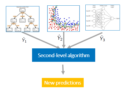
More generally, you can think about using weighted averages.
For example, you might believe that some of the models are better or
more accurate and you want to manually assign higher weights to them.
But an even better approach might be to estimate these weights more
intelligently by using another layer of learning algorithm. This
approach is called model stacking. Model stacking is an efficient ensemble method in which the
predictions, generated by using various machine learning algorithms, are
used as inputs in a second-layer learning algorithm. This second-layer
algorithm is trained to optimally combine the model predictions to form a
new set of predictions. For example, when linear regression is used as
second-layer modeling, it estimates these weights by minimizing the
least square errors. However, the second-layer modeling is not
restricted to only linear models; the relationship between the
predictors can be more complex, opening the door to employing other
machine learning algorithms.
Model stacking uses a second-level algorithm to estimate prediction weights in the ensemble model.
Meet me at O'Reilly
Join me at the O’Reilly Artificial Intelligence
Conference April 30-May 2 to learn more about combining traditional
statistical techniques with machine learning algorithms. Don’t miss
these SAS presentations: Long-Term Time Series Forecasting With Recurrent Neural Networks Mustafa Kabul, Senior Data Scientist, SAS
May 1 | 11:55 a.m. – 12:35 p.m. Improving Wildlife Conservation With Artificial Intelligence Mary Beth Ainsworth, AI and Language Analytics Strategist, SAS
May 1 | 2:35 – 3:15 p.m. Well-Established Statistical Techniques + Modern Machine Learning Algorithms Funda Gunes, Senior Machine Learning Developer, SAS
May 2 | 1:45 – 2:25 p.m. Online and Active Learning for Recommender Systems Jorge Silva, Principal Machine Learning Developer, SAS
May 2 | 4:50 – 5:30 p.m.
Winning data science competitions with ensemble modeling
Ensemble modeling and model stacking are especially popular in data
science competitions, in which a sponsor posts a training set (which
includes labels) and a test set (which does not include labels) and
issues a global challenge to produce the best predictions of the test
set for a specified performance criterion. The winning teams almost
always use ensemble models instead of a single fine-tuned model. Often
individual teams develop their own ensemble models in the early stages
of the competition, and then join their forces in the later stages.
On the popular data science competition site Kaggle
you can explore numerous winning solutions through its discussion
forums to get a flavor of the state of the art. Another popular data
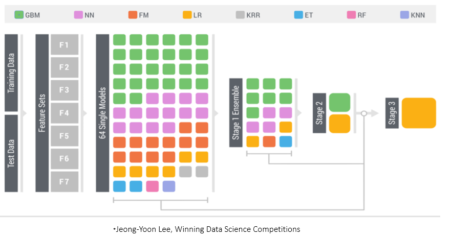
science competition is the KDD Cup. The following figure shows the winning solution for the 2015 competition, which used a three-stage stacked modeling approach.
The figure shows that a diverse set of 64 single models were used to
build the model library. These models are trained by using various
machine learning algorithms. For example, the green boxes represent
gradient boosting models (GBM), pink boxes represent neural network
models (NN), and orange boxes represent factorization machines models
(FM). You can see that there are multiple gradient boosting models in
the model library; they probably vary in their use of different
hyperparameter settings and/or feature sets.
At stage 1, the predictions from these 64 models are used as inputs
to train 15 new models, again by using various machine learning
algorithms. At stage 2 (ensemble stacking), the predictions from the 15
stage 1 models are used as inputs to train two models by using gradient
boosting and linear regression. At stage 3 ensemble stacking (the final
stage), the predictions of the two models from stage 2 are used as
inputs in a logistic regression (LR) model to form the final ensemble.
In order to build a powerful predictive model like the one that was used to win the 2015 KDD Cup, building a diverse set of initial models plays an important role! There are various ways to enhance diversity such as using:
Different training algorithms.
Different hyperparameter settings.
Different feature subsets.
Different training sets.
A simple way to enhance diversity is to train models by using
different machine learning algorithms. For example, adding a
factorization model to a set of tree-based models (such as random forest
and gradient boosting) provides a nice diversity because a
factorization model is trained very differently than decision tree
models are trained. For the same machine learning algorithm, you can
enhance diversity by using different hyperparameter settings and subsets
of variables. If you have many features, one efficient method is to
choose subsets of the variables by simple random sampling. Choosing
subsets of variables could be done in more principled fashion that is
based on some computed measure of importance which introduces the large
and difficult problem of feature selection.
In addition to using various machine learning training algorithms and
hyperparameter settings, the KDD Cup solution shown above uses seven
different feature sets (F1-F7) to further enhance the diversity.
Another simple way to create diversity is to generate various versions
of the training data. This can be done by bagging and cross validation.
How to avoid overfitting stacked ensemble models
Overfitting is an omnipresent concern in building predictive models,
and every data scientist needs to be equipped with tools to deal with
it. An overfitting model is complex enough to perfectly fit the training
data, but it generalizes very poorly for a new data set. Overfitting is
an especially big problem in model stacking, because so many predictors
that all predict the same target are combined. Overfitting is partially
caused by this collinearity between the predictors.
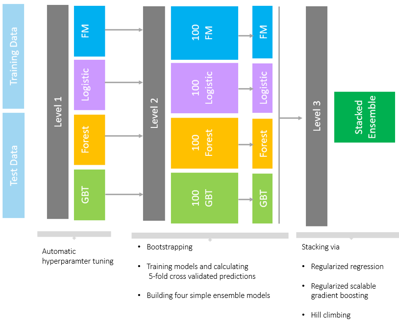
The most efficient techniques for training models (especially during
the stacking stages) include using cross validation and some form of
regularization. To learn how we used these techniques to build stacked
ensemble models, see our recent SAS Global Forum paper, "Stacked Ensemble Models for Improved Prediction Accuracy." That
paper also shows how you can generate a diverse set of models by
various methods (such as forests, gradient boosted decision trees,
factorization machines, and logistic regression) and then combine them
with stacked ensemble techniques such regularized regression methods,
gradient boosting, and hill climbing methods.
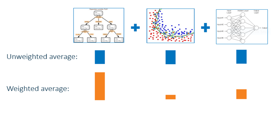
The following image provides a simple summary of our ensemble
approach. The complete model building approach is explained in detail
in the paper. A computationally intense process such as this benefits
greatly by running in a distributed execution environment offered in the
SAS® Viya platform by using SAS® Visual Data Mining and Machine Learning.
A diverse set of models combined with stacked ensemble techniques.
Applying stacked models to real-world big data problems can produce
greater prediction accuracy and robustness than do individual models.
The model stacking approach is powerful and compelling enough to alter
your initial data mining mindset from finding the single best model to
finding a collection of really good complementary models.
Of course, this method does involve additional cost both because you
need to train a large number of models and because you need to use cross
validation to avoid overfitting. However, SAS Viya provides a modern
environment that enables you to efficiently handle this computational
expense and manage an ensemble workflow by using parallel computation in
a distributed framework. To learn more, check out our paper, "Stacked Ensemble Models for Improved Prediction Accuracy," and read the SAS Visual Data Mining and Machine Learning documentation.
Presented at Data Science Salon in Dallas by Brian Kursar, Vice President and Chief Data Scientist at Toyota Connected.
Data
is everywhere: in our digital footprint, in our financial system, and
in our cities, down to the very cars we drive. Vehicles have become
increasingly smart, and are now rich sources of data from which to
derive valuable insights about customer behavior. We were thrilled to be
joined by Brian Kursar, Vice President and Chief Data Scientist at
Toyota Connected at the Data Science Salon in Dallas. He imagines a
future where cars continue to add value to their drivers far after they
leave the dealership. Here’s the transcript, from his fascinating talk.
I’m
very excited to talk to everyone about Toyota Connected! First off let
me just ask who here has heard of Toyota Connected. No, not
Toyota — Toyota Connected. Wow, very very cool! For those of you who
don’t know, Toyota Connected is a brand new company. We are about three
minutes away from the corporate office. And we are a for-profit company.
What we do is we are the arm for data science and data engineering for
Toyota. We are a start-up and a start-up in the sense that we truly are a
startup — we have about 200 engineers, we work in a different building,
our culture is completely different than Toyota Motors in North America
but we are powered by Toyota. We have a lot of the backing by the
parent company and that really allows us to do a lot of things [that
are] very innovative [in] a very different type of culture where we’re
empowering our team with the ability to make decisions and to follow
through in those decisions. As I mentioned, it’s a completely different
office and if you walk into our office you will notice we have a
dog-friendly policy and we have free lunches for everyone. As a matter
of fact one of my favorite things about Toyota Connected is they
actually label the vegan soups which is a something that makes me very
happy.
Let
me talk a little bit about where we see things and where Toyota
Connected fits in. We see that the car is really an essential piece of
the internet of everything. You really start out with the Toyota
Connected car. And what is that? Behind the scenes every Toyota
Connected car coming out since July 2017 is able to transmit sensors of
data representing various things such as whether or not the windows are
down, GPS, speedometer, odometer, steering angle. But all of these we do
only with the consent of the customer. These vehicles actually are dead
when you go to the dealership. But we will actually walk you through
some of the various use cases for our safety connect program and this is
what I’ll be talking about today. However we only enable it once the
customer understands what data we’re collecting and how we’re using that
data to create new and exciting services for them. The
average customer drives about 48 minutes per day — about 500+ unique
data points are generated every 200 milliseconds and that really comes
out to about 7.2 million data points per connected vehicle per day
[that’s] A LOT OF DATA! Petabytes of data!What do we do
with it? First and foremost as I mentioned earlier [we] write data
services that drive customer satisfaction, we’re looking to create new
and exciting services that make driving safer, more convenient, and fun.
Next we’ll use that data to really derive new insights to make our
products better.
In
the very short time that Toyota Connected has been around, for two
years now — we’ve had a number of milestones. In April 2017, we worked
with the folks in Tour to connect [with] Japan on a project called Japan
Taxi which I’ll be talking about in a moment. The connected car went
live in July of 2017 and that was for the model year Camry 2018. We then
looked at actually using that data in what we call a car share pilot on
the Island of Hawaii with a company that does distribution for our
vehicles there. And then finally we went live with the car share pilot
we now called Hui as well as going forward with Avis to be able to
connect the vehicles in their rental problem transactions. Japan Taxi
was our first really deep dive into the connected car because this was
done before vehicles in the U.S. were connected. Actually this was done
before vehicles in the US or Japan were connected. For this pilot we
teamed up with TRI. For those who don’t know, TRI is the research arm of
Toyota that focuses on the autonomous vehicle. This was an opportunity
to really work with them to collect data and provide them data from
actual people driving taxis in Japan. With this project, we used special
aftermarket devices for eight hours a day every day — and actually it’s
still going now — we are collecting the data from these trips. If you
look here, this is actually a really quick video of our application that
we created. In this application, each dot represents a vehicle and all
this is collected in real time — you can actually drill in to one of the
vehicles and then see the vehicles driving. This one here is driving
late at night (our morning, night in Japan) on the streets.
What do we use this for?
This is actually what we’re doing: leveraging machine learning, optic
recognition and then providing that and those videos to Tour, the
research institute, to be able to take what they’re finding and create
their own algorithms to improve the autonomous vehicle. Another thing we
do is outside of research, we look at new ways to provide new services
for our customers. One of the things is we’re developing a driver score
that’s gonna be live probably in the next four to six months. Actually
Demuth’s working on it — he’s sitting in the back there and he can talk
to you more about that if you’re interested. Here’s what a driving score
is: we have a set of metrics or rules that Nitsa provides and to enable
us to take what we call CANbus data or data that’s coming out of the
vehicle and derive insights and scores on different types of events.
Primarily we’re looking at longitudinal and lateral g-force, you’re
looking at the location, speed, and then how much you’re applying on
brake pressure. To give you an example [let’s] really drill down into
four trips. The Green will represent what we call smooth driving. I mean
not going past the speed limit, you’re not doing the harsh braking,
you’re not having any harsh right turns or left turns or over speeding.
The red there is what we would call harsh braking. Then you got that
maroon which I can’t don’t think you see well in here, which represents
over speeding. Above the line there you’ve got the horsepower
acceleration, and here I don’t think we have any hard left turns. What
does this look like? They’re actually drilling down even further, so
here’s one of those trips, and as you can see here the green just drills
down. The green shows that the person currently driving here is driving
37.96 miles per hour, the location at that point is 40 miles per hour
therefore it’s green. There’s no harsh braking, there’s no longitude or
added lateral g-force popping out, and as you can see for the most part
this person is driving smooth. Just about 15 seconds later you can
actually see that this person is now speeding. The speed limit there is
30 miles per hour and this person is going 49.56 miles per hour. Keep in
mind every one of these dots is a single second. Four seconds later
this customer actually hits the brakes really hard, and now you’re able
to see that red line or the red circle which shows harsh braking.
That’s nice information — what are we doing with that?
We’re able to provide the customer with driving tips. These are tips
that will help them understand their overall trip score, what their
acceleration is, what their speed is. We are able to now take these tips
and show them how they can get better miles per gallon. We’re also able
to allow them to say, this is my data and I’m going to actually do
something with it. They can take this data and they can send it out to a
another service called Toyota Information Insurance Management
Services. If they are a good driver, they can send this data to
different insurance companies and have them bid for discounts for that
customer. US models starting with Camry 2018 which came out in July have
these sensors. Now these sensors are actually dead at the
dealership — you have to actually go through a walkthrough where the
dealer talks to you about what the data is collected how it’s being
collected and then you can actually opt-in. We don’t we don’t collect
the data unless you opt-in, but it’s for the most recent Camry, the
upcoming rav4, upcoming Avalon, and I think there’s a handful of Lexus
vehicles as well. Fleet is one of our number one customers because the
fleet customers want to know things that are a lot more detailed in
terms of vehicle location. They want to understand such things as, are
the windows open or closed, has the car been in a collision, what is the
fuel level.
A
lot of things that I mentioned earlier with the Avis project that’s
actually gone live for a fleet to be able to understand the health of
the vehicle and to cut down on the time that they’re spending on the
checkout process. It’s not in blockchain but we do have a data store
that the data is being saved in, yes. Question: hey why do you call it a G Force because what you’re really measuring is stress, strain, and shear forces?
G forces are typically used as a nomenclature when you have a force
large enough to make it feel like a percentage of gravity — at least
half a G. Right, so the transfer of the G Force is from kinetic energy
to potential energy. That’s how we are able to understand our harsh
cornering, harsh braking as well. It’s not just the brake pressure at
all, true, but I think that’s the way that we look at it. There is a
guideline and they actually consider it as g-force. You can actually get
it after the trip is completed, we do this at a trip level. We do have
the potential to provide it in real time but we actually only provide
that at the end of the trip for at least the next version that will be
coming out.
The
next type of service that we provide is what we call collision
detection. Very similarly we’re looking at the longitudinal lateral
g-force, the acceleration, brake pressure. Here I’d like to say that you
know the data really tells a story and this is just an example — where
we have the longitudinal, lateral, and vertical g-force; so that’s the
X, Y, & Z axis here. And here you can see the acceleration — a red
line here and so as the customer is driving and they accelerate you can
actually see that in that line coming down here and it goes to about
there as they stop. Now the moment you see that transfer of energy — you
can see that it’s right about here — and that’s actually what we’re
able to use to understand collision notifications. The problem is
that — this person was lucky because the airbag was triggered — the way
the sensors are set up on the vehicle as well as how we are measuring
that, we were able to understand front collisions and we’ve been doing
that for many, many years. But the problem is that the airbag does not
go off when you have a rear-end collision or side collision or if you
were to flip over and find yourself in the bottom of a ditch. And so
because of that we’ve realized that we have to now really start looking
at the data a little bit differently and understand that some of the
airbag sensors that yes, they do trigger a notification and they will
call the paramedics — these are things that are not enough to ensure the
safety of our customers.
What
we’ve been doing now, is looking at classifying crashes into three
different buckets, and then also looking at how do we eliminate some of
the false positives. For instance, this is the area right here where
you’re going between five and eight point five in the magnitude of the
g-force and that’s where we traditionally will have airbags deployed. If
you then go and look at areas that are not being looked at — these are
things that we mentioned, you know the high to medium/low speed crashes
where it is a side impact, where it is a rear impact, where the cars
flipped over. Now those are the areas where we need to be able to
understand but also eliminate the false positive. Harsh braking and
harsh cornering are absolutely false positives. What about other things
like hitting a shopping cart? Well that’s not so bad. What about going
over a speed bump? Well that’s also not a collision. We teamed up with a
number of companies to pull in data so that we can actually compare
some of the things like video data, data where they’ve actually done
crash tests — and then pass those through our models to be able to
derive kind of what we call the area of opportunity or the areas where
we can now provide newer and better services than were available before.
Different
drivers who drive in the same car have different styles — like my wife
and I, we share one of those Camrys. In the future though I think we
will have head units [that] are very much like Netflix, where you can
actually use a profile and based on that profile it’ll be able to keep
your settings from a temperature perspective, what radio stations you
listen to, what are the places that you like to eat, or do
recommendations. However, we don’t have that today in our vehicles.
Today
we do use cloud, and we only use cloud for what we’re doing today in
terms of metadata management. When this application was created, we had
specifications coming from our product engineers that really defined all
the data. It’s telemetry data, it’s all structured, we have data
dictionaries on everything to help the data scientists understand what
it is. One of the things that we are doing as a new company, we are
really starting on our journey to data science. I was actually hired to
build out a data science practice for the company. We pulled all of our
data scientists to gather and really talk about the things that are
possible with this data — we d this on regular basis.
There’s
a lot of things that we see from a services perspective that we can
provide to the customer. In fact, we only do this to provide services
for the customer. There’s no reason to use the data unless we can make
our products better and we can provide these new types of services for
our customers. For instance, in this case we envision that when our
collision notification is ready to be deployed — this is something that
we’ll be calling you over the telephone and having someone saying “hey
we noticed that there’s been a collision, are you okay?” — if someone
doesn’t answer we dispatch a unit to that location. Or being able to
essentially have a notification pop-up on their phone, saying do you
need to send assistance? There’s going to be low impact use cases where
someone got rear-ended, we still want to be there for our customer. I
think that there was a statistic that one of our data scientists
provided me, which was, one out of every ten collisions that ends in a
fatality could have been prevented if we had the ability to get someone
dispatched quicker. For me, that’s something that I’m definitely looking
towards seeing what we can do on our side to make a difference there
and to make our vehicles safer.
We’ve
talked a lot about what we do as a company. From a company culture
perspective, we are absolutely focused on bringing in the best talent.
We are really connected and are committed to helping folks understand
what we are all about, what we do and entice anyone that might be
interested to work for us. We have a number of open positions and please
come see me if you’re interested :).
I
bought a Toyota Camry mostly because I wanted to understand the full
experience, what is it that our dealerships are truly saying to the
customer and just so I could understand and be able to talk about it as a
Toyota customer. I was actually very impressed with the way they walked
me through everything and how they showed us these are things that you
can do to enable these services and this is the data we collect and the
reality is that when my wife is driving the car of course I’m gonna
opt-in. Why? Because I want safety connect. Why? Because if she’s ever
in an accident they’re there for her. These are services that I think
people are going to opt-in for because they provide a genuine value add
to the vehicle. I bought the vehicle also because it has what they call
smart sense to be able to understand if someone’s to the right or left
to me before I’m making a lane change. All of this really comes down to
safety features. From a scale perspective we definitely recognize that
the cost to be able to provide these services is something that we’re
grappling with. We’re absolutely looking at ways to optimize
algorithms — how we’re storing the data, when how much we’re storing, to
really only hold the value add attributes to be able to do these
algorithms and provide these services. Thank you very much!
We’ve
got a lineup of equally impressive speakers from companies like Viacom,
Netflix, Buzzfeed, Forbes, Verizon, Nielsen, Comcast, Bloomberg, Uber,
Google and many, many more.
Github: https://github.com/pengpaiSH/Kaggle_NCFM
Step1. Download dataset from https://www.kaggle.com/c/the-nature-conservancy-fisheries-monitoring/data
Step2. Use split_train_val.py to split the labed data into training
and validation. Usually, 80% for training and 20% for validation is a
good start.
Step3. Use train.py to train a Inception_V3 network. The best model and its weights will be saved as "weights.h5".
Step4. Use predict.py to predict labels for testing images and
generating the submission file "submit.csv". Note that such submission
results in a 50% ranking in the leaderboard.
Step5. In order to improve our ranking, we use data augmentation for
testing images. The intuition behind is similar to multi-crops, which
makes use of voting ideas. predict_average_augmentation.py implements
such idea and results in a 10% ranking (Public Score: 1.09) in the
leaderboard.
Step 6. Note that there is still plenty of room for improvement. For
example, we could split data into defferent training and valition data
by cross-validation, e.g. k-fold. Then we train k models based on these
splitted data. We average the predictions output by the k models as the
final submission. This strategy will result a 5% ranking (Public Score:
1.02) in the leaderboard. We will leave the implementation as a practice
for readers :)
Step 7: if you wanna to improve ranking further, object detection is your next direction!
Update and Note: In order to use flow_from_directory(), you should create a folder named test_stg1 and put the original test_stg1 inside it.
Feature engineering, feature selection, and model evaluation
Like most problems in life, there are several potential approaches to a Kaggle competition:
Lock yourself away from the outside world and work in isolation
I
recommend against the “lone genius” path, not only because it’s
exceedingly lonely, but also because you will miss out on the most
important part of a Kaggle competition: learning from other data scientists.
If you work by yourself, you end up relying on the same old methods
while the rest of the world adopts more efficient and accurate
techniques.
As
a concrete example, I recently have been dependent on the random forest
model, automatically applying it to any supervised machine learning
task. This competition finally made me realize that although the random
forest is a decent starting model, everyone else has moved on to the
superior gradient boosting machine.
The other extreme approach is also limiting:
2. Copy one of the leader’s scripts (called “kernels” on Kaggle), run it, and shoot up the leaderboard without writing a single line of code
I
also don’t recommend the “copy and paste” approach, not because I’m
against using other’s code (with proper attribution), but because you
are still limiting your chances to learn. Instead, what I do recommend
is a hybrid approach: read what others have done, understand and even
use their code, and build on other’s work with your own ideas. Then,
release your code to the public so others can do the same process,
expanding the collective knowledge of the community.
In
the second part of this series about competing in a Kaggle machine
learning competition, we will walk through improving on our initial
submission that we developed in the first part.
The major results documented in this article are:
An increase in ROC AUC from a baseline of 0.678 to 0.779
Over 1000 places gained on the leaderboard
Feature engineering to go from 122 features to 1465
Feature selection to reduce the final number of features to 342
Decision to use a gradient boosting machine learning model
We
will walk through how we achieve these results — covering a number of
major ideas in machine learning and building on other’s code where
applicable. We’ll focus on three crucial steps of any machine learning
project:
Feature engineering
Feature selection
Model evaluation
To
get the most out of this post, you’ll want to follow the Python
notebooks on Kaggle (which will be linked to as they come up). These
notebooks can be run on Kaggle without downloading anything on your
computer so there’s little barrier to entry! I’ll hit the major points
at a high-level in this article, with the full details in the notebooks.
Brief Recap
If you’re new to the competition, I highly recommend starting with this article and this notebook to get up to speed.
The Home Credit Default Risk competition
on Kaggle is a standard machine learning classification problem. Given a
dataset of historical loans, along with clients’ socioeconomic and
financial information, our task is to build a model that can predict the
probability of a client defaulting on a loan.
In the first part of this series,
we went through the basics of the problem, explored the data, tried
some feature engineering, and established a baseline model. Using a
random forest and only one of the seven data tables, we scored a 0.678 ROC AUC (Receiver Operating Characteristic Area Under the Curve) on the public leaderboard. (The public leaderboard is calculated with only 20% of the test data and the final standings usually change significantly.)
To
improve our score, in this article and a series of accompanying
notebooks on Kaggle, we will concentrate primarily on feature
engineering and then on feature selection. Generally, the largest benefit relative to time invested
in a machine learning problem will come in the feature engineering
stage. Before we even start trying to build a better model, we need to
focus on using all of the data in the most effective manner!
Notes on the Current State of Machine Learning
Much
of this article will seem exploratory (or maybe even arbitrary) and I
don’t claim to have made the best decisions! There are a lot of knobs to
tune in machine learning, and often the only approach is to try out
different combinations until we find the one that works best. Machine
learning is more empirical than theoretical and relies on testing rather
than working from first principles or a set of hard rules.
In a great blog post, Pete Warden
explained that machine learning is a little like banging on the side of
the TV until it works. This is perfectly acceptable as long as we write
down the exact “bangs” we made on the TV and the result each time.
Then, we can analyze the choices we made, look for any patterns to
influence future decisions, and find which method works the best.
My
goal with this series is to get others involved with machine learning,
put my methods out there for feedback, and document my work so I can
remember what I did for the next time! Any comments or questions, here
or on Kaggle, are much appreciated.
Feature Engineering
Feature engineering
is the process of creating new features from existing data. The
objective is to build useful features that can help our model learn the
relationship between the information in a dataset and a given target. In
many cases — including this problem — the data is spread across multiple tables.
Because a machine learning model must be trained with a single table,
feature engineering requires us to summarize all of the data in one
table.
This competition has a total of 7 data files.
In the first part, we used only a single source of data, the main file
with socioeconomic information about each client and characteristics of
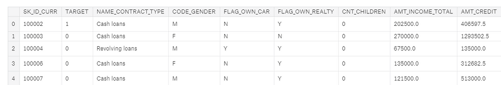
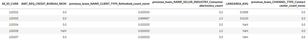
the loan application. We will call this table app.(For those used to Pandas, a table is just a dataframe).
Main training dataframe
We can tell this is the training data because it includes the label, TARGET. A TARGET value of 1 indicates a loan which was not repaid.
The app dataframe is tidy structured data: there is one row for every observation — a client’s application for a loan — with the columns containing the features
(also known as the explanatory or predictor variables). Each client’s
application — which we will just call a “client” — has a single row in
this dataframe identified by the SK_ID_CURR.
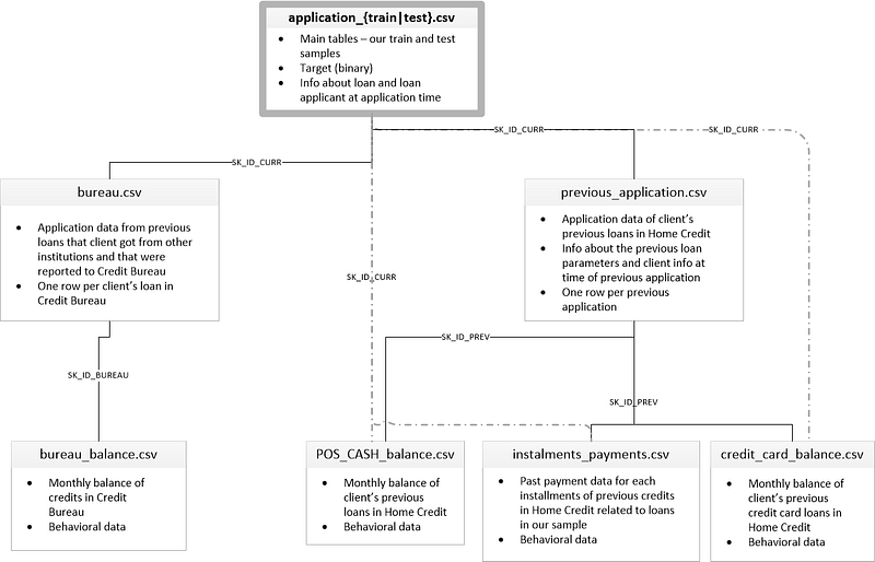
Because each client has a unique row in this dataframe, it is the
parent of all the other tables in the dataset as indicated by this
diagram showing how the tables are related:
When
we make our features, we want to add them to this main dataframe. At
the end of feature engineering, each client will still have only a
single row, but with many more columns capturing information from the
other data tables.
The six other tables contain information about clients’ previous loans, both with Home Credit (the institution running the competition), and other credit agencies. For example, here is the bureau dataframe, containing client’s previous loans at other financial institutions:
bureau dataframe, a child of app
This dataframe is a child table of the parentapp: for each client (identified by SK_ID_CURR)
in the parent, there may be many observations in the child. These rows
correspond to multiple previous loans for a single client. The bureau dataframe in turn is the parent of the bureau_balance dataframe where we have monthly information for each previous loan.
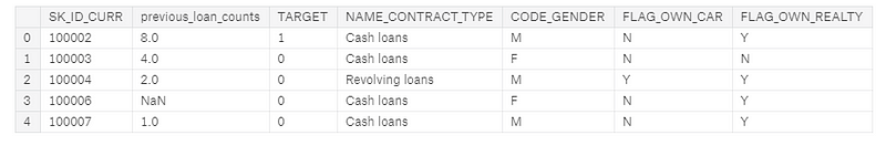
Let’s
look at an example of creating a new feature from a child dataframe:
the count of the number of previous loans for each client at other
institutions. Even though I wrote a post about automated feature engineering, for this article we will stick to doing it by hand. The first Kaggle notebook to look at is here: is a comprehensive guide to manual feature engineering.
Calculating this one feature requires grouping (using groupby)the bureau dataframe by the client id, calculating an aggregation statistic (using agg with count) and then merging (using merge)
the resulting table with the main dataframe. This means that for each
client, we are gathering up all of their previous loans and counting the
total number. Here it is in Python:
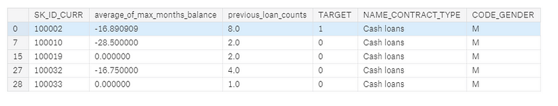
app dataframe with new feature in second column
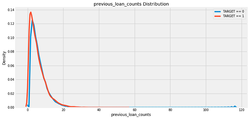
Now
our model can use the information of the number of previous loans as a
predictor for whether a client will repay a loan. To inspect the new
variable, we can make a kernel density estimate (kde) plot.
This shows the distribution of a single variable and can be thought of
as a smoothed histogram. To see if the distribution of this feature
varies based on whether the client repaid her/his loan, we can color the
kde by the value of the TARGET:
There does not appear to be much of a difference in the distribution, although the peak of the TARGET==1 distribution is slightly to the left of the TARGET==0
distribution. This could indicate clients who did not repay the loan
tend to have had fewer previous loans at other institutions. Based on my
extremely limited domain knowledge, this relationship would make sense!
Generally,
we do not know whether a feature will be useful in a model until we
build the model and test it. Therefore, our approach is to build as many
features as possible, and then keep only those that are the most
relevant. “Most relevant” does not have a strict definition, but we will
see some ways we can try to measure this in the feature selection
section.
Now let’s look at capturing information not from a direct child of the app dataframe, but from a child of a child of app! The bureau_balance dataframe contains monthly information about each previous loan. This is a child of the bureau
dataframe so to get this information into the main dataframe, we will
have to do two groupbys and aggregates: first by the loan id (SK_ID_BUREAU) and then by the client id.
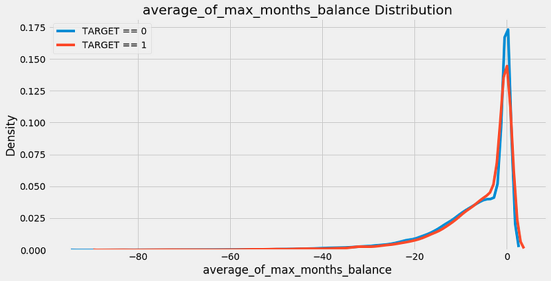
As an example, if we want to calculate for each client the average of the max number of MONTHS_BALANCE for each previous loan in the bureau_balance dataframe, we can do this:
app dataframe with new feature in second column
Distribution of new feature
This
was a lot of code for a single feature, and you can easily imagine that
the manual feature engineering process gets tedious after a few
features! That’s why we want to write functions that take these
individual steps and repeat them for us on each dataframe.
Instead of repeating code over and over, we put it into a function — called refactoring — and
then call the function every time we want to perform the same
operation. Writing functions saves us time and allows for more
reproducible workflows because it will execute the same actions in
exactly the same way every time.
Below
is a function based on the above steps that can be used on any child
dataframe to compute aggregation statistics on the numeric columns. It
first groups the columns by a grouping variable (such as the client id),
calculates the mean, max, min, sum of
each of these columns, renames the columns, and returns the resulting
dataframe. We can then merge this dataframe with the main app data.
(Half
of the lines of code for this function is documentation. Writing proper
docstrings is crucial not only for others to understand our code, but
so we can understand our own code when we come back to it!)
To see this in action, refer to the notebook, but clearly we can see this will save us a lot of work, especially with 6 children dataframes to process.
This
function handles the numeric variables, but that still leaves the
categorical variables. Categorical variables, often represented as
strings, can only take on a limited number of values (in contrast to
continuous variables which can be any numeric value). Machine learning
models cannot handle string data types, so we have to find a way to capture the information in these variables in a numeric form.
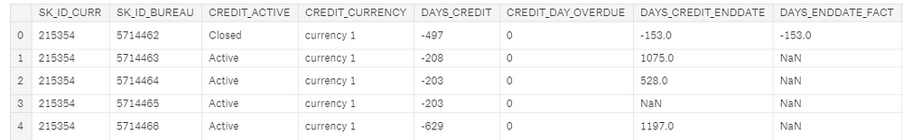
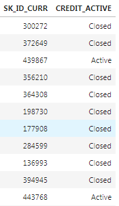
As an example of a categorical variable, the bureau table has a column called CREDIT_ACTIVE that has the status of each previous loan:
Two columns of the bureau dataframe showing a categorical variable (CREDIT_ACTIVE)
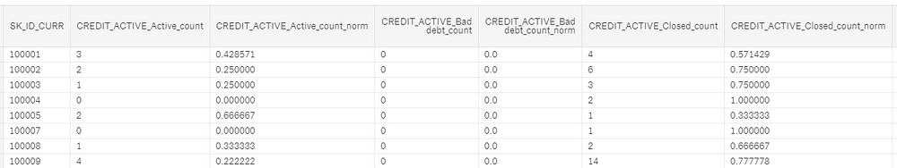
We
can represent this data in a numeric form by counting the number of
each type of loan that each client has had. Moreover, we can calculate
the normalized count of each loan type by dividing the count for one
particular type of loan by the total count. We end up with this:
Categorical CREDIT_ACTIVE features after processing
Now
these categorical features can be passed into a machine learning model.
The idea is that we capture not only the number of each type of
previous loan, but also the relative frequency of that type of loan. As
before, we don’t actually know whether these new features will be useful
and the only way to say for sure is to make the features and then test
them in a model!
Rather
than doing this by hand for every child dataframe, we again can write a
function to calculate the counts of categorical variables for us.
Initially, I developed a really complicated method for doing this
involving pivot tables and all sorts of aggregations, but then I saw
other code where someone had done the same thing in about two lines
using one-hot encoding. I promptly discarded my hours of work and used
this version of the function instead!
This function once again saves us massive amounts of time and allows us to apply the same exact steps to every dataframe.
Once
we write these two functions, we use them to pull all the data from the
seven separate files into one single training (and one testing
dataframe). If you want to see this implemented, you can look at the first and second manual engineering notebooks. Here’s a sample of the final data:
Using information from all seven tables, we end up with a grand total of 1465 features! (From an original 122).
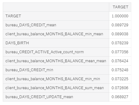
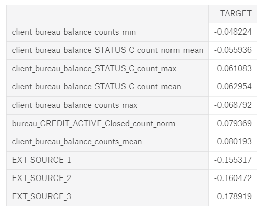
How do we know if any of these features are helpful? One method is to calculate the Pearson correlation coefficient between the variables and the TARGET.
This is a relatively crude measure of importance, but it can serve as
an approximation of which variables are related to a client’s ability to
repay a loan. Below are the most correlated variables with the TARGET:
Most Positive (left) and Negative (right) correlated variables with the TARGET
The EXT_SOURCE_
variables were from the original features, but some of the variables we
created are among the top correlations. However, we want to avoid
reading too much into these numbers. Anytime we make a ton of features,
we can run into the multiple comparisons problem:
the more comparisons we make — in this case correlations with the
target — the more likely some of them are to be large due to random
noise. With correlations this small, we need to be especially careful
when interpreting the numbers.
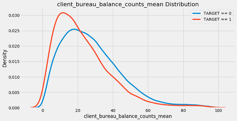
The most negatively correlated variable we made, client_bureau_balance_counts_mean, represents the average for each client of the count of the number of times a loan appeared in the bureau_balance data. In other words, it is the average number of monthly records per previous loan for each client. The kde plot is below:
Now that we have 1465 features, we run into the problem of too many features! More menacingly, this is known as the curse of dimensionality, and it is addressed through the crucial step of feature selection.
Feature Selection
Too
many features can slow down training, make a model less interpretable,
and, most critically, reduce the model’s generalization performance on
the test set. When we have irrelevant features, these drown out the
important variables and as the number of features increases, the number
of data points needed for the model to learn the relationship between
the data and the target grows exponentially (curse of dimensionality explained).
After
going to all the work of making these features, we now have to select
only those that are “most important” or equivalently, discard those that
are irrelevant.
The next notebook to go through is here: a guide to feature selection which is fairly comprehensive although it still does not cover every possible method!
There are many ways to reduce the number of features, and here we will go through three methods:
Removing collinear variables
Removing variables with many missing values
Using feature importances to keep only “important” variables
Remove Collinear Variables
Collinear variables
are variables that are highly correlated with one another. These
variables are redundant in the sense that we only need to keep one out
of each pair of collinear features in order to retain most of the
information in both. The definition of highly correlated can vary and
this is another of those numbers where there are no set rules! As an
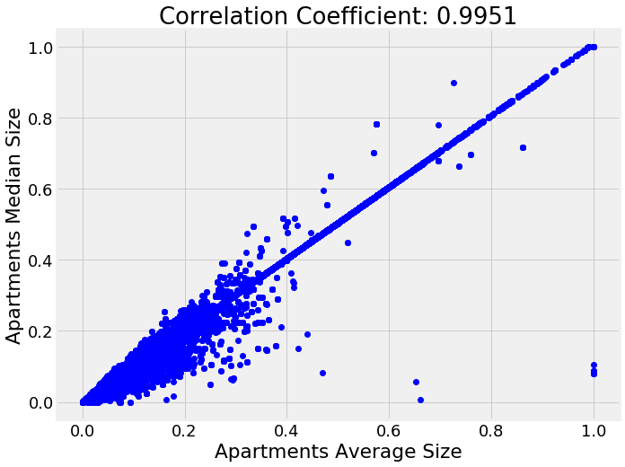
example of collinear variables, here is a plot of the median apartment
size vs average apartment size:
To
identify highly correlated variables, we can calculate the correlation
of every variable in the data with every other variable (this is quite a
computationally expensive process)! Then we select the upper triangle
of the correlation matrix and remove one variable from every pair of
highly correlated variables based on a threshold. This is implemented in
code below:
In
this implementation, I use a correlation coefficient threshold of 0.9
to remove collinear variables. So, for each pair of features with a
correlation greater than 0.9, we remove one of the pair of features. Out of 1465 total features, this removes 583, indicating many of the variables we created were redundant.
Remove Missing Columns
Of
all the feature selection methods, this seems the most simple: just
eliminate any columns above a certain percentage of missing values.
However, even this operation brings in another choice to make, the threshold percentage of missing values for removing a column.
Moreover, some models, such as the Gradient Boosting Machine in LightGBM,
can handle missing values with no imputation and then we might not want
to remove any columns at all! However, because we’ll eventually test
several models requiring missing values to be imputed, we’ll remove any
columns with more than 75% missing values in either the training or
testing set.
This
threshold is not based on any theory or rule of thumb, rather it’s
based on trying several options and seeing which worked best in
practice. The most important point to remember when making these choices
is that they don’t have to be made once and then forgotten. They can be
revisited again later if the model is not performing as well as
expected. Just make sure to record the steps you took and the
performance metrics so you can see which works best!
Dropping columns with more than 75% missing values removes 19 columns from the data, leaving us with 863 features.
Feature Selection Using Feature Importances
The
last method we will use to select features is based on the results from
a machine learning model. With decision tree based classifiers, such as
ensembles of decision trees (random forests, extra trees, gradient
boosting machines), we can extract and use a metric called the feature
importances.
The technical details of this is complicated (it has to do with the reduction in impurity from including the feature
in the model), but we can use the relative importances to determine
which features are the most helpful to a model. We can also use the
feature importances to identify and remove the least helpful features to
the model, including any with 0 importance.
To find the feature importances, we will use a gradient boosting machine (GBM) from the LightGBM library.
The model is trained using early stopping with two training iterations
and the feature importances are averaged across the training runs to
reduce the variance.
Running this on the features identifies 308 features with 0.0 importance.
Removing
features with 0 importance is a pretty safe choice because these are
features that are literally never used for splitting a node in any of
the decision trees. Therefore, removing these features will have no
impact on the model results (at least for this particular model).
This
isn’t necessary for feature selection, but because we have the feature
importances, we can see which are the most relevant. To try and get an
idea of what the model considers to make a prediction, we can visualize
the top 15 most important features:
Top 15 most important features
We
see that a number of the features we built made it into the top 15
which should give us some confidence that all our hard work was
worthwhile! One of our features even made it into the top 5. This
feature, client_installments_AMT_PAYMENT_min_sum
represents the sum of the minimum installment payment for each client
of their previous loans at Home Credit. That is, for each client,it is
the sum of all the minimum payments they made on each of their previous
loans.
The
feature importance don’t tell us whether a lower value of this variable
corresponds to lower rates of default, it only lets us know that this
feature is useful for making splits of decision trees nodes. Feature
importances are useful, but they do not offer a completely clear interpretation of the model!
After
removing the 0 importance features, we have 536 features and another
choice to make. If we think we still have too many features, we can
start removing features that have a minimal amount of importance. In
this case, I continued with feature selection because I wanted to test
models besides the gbm that do not do as well with a large number of
features.
The
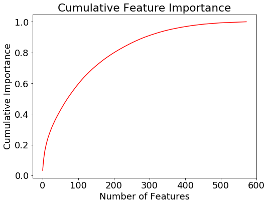
final feature selection step we do is to retain only the features
needed to account for 95% of the importance. According to the gradient
boosting machine, 342 features are enough to cover 95% of the
importance. The following plot shows the cumulative importance vs the
number of features.
Cumulative feature importance from the gradient boosting machine
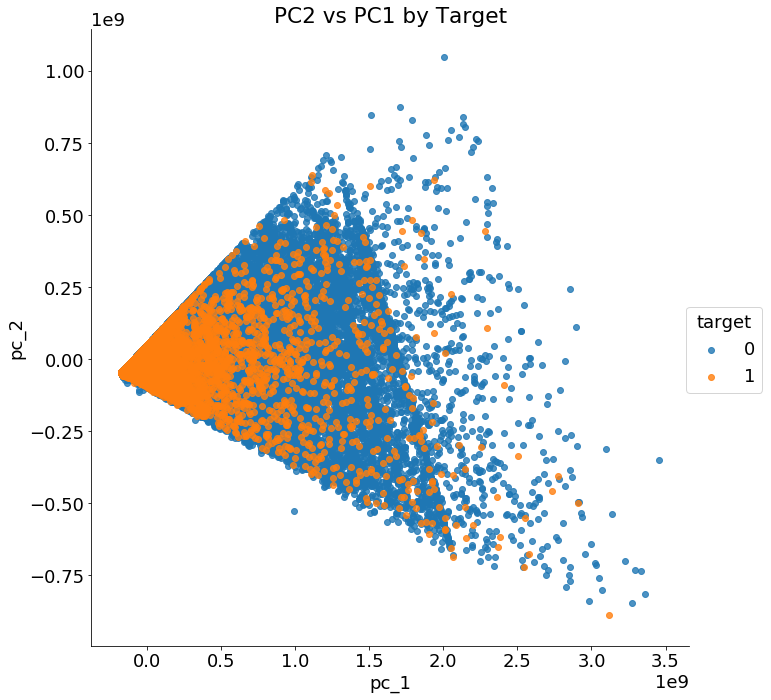
There are a number of other dimensionality reduction techniques we can use, such as principal components analysis (PCA).
This method is effective at reducing the number of dimensions, but it
also transforms the features to a lower-dimension feature space where
they have no physical representation, meaning that PCA features cannot
be interpreted. Moreover, PCA assumes the data is normally distributed,
which might not be a valid assumption for human-generated data. In the
notebook I show how to use pca, but don’t actually apply it to the data.
We can however use pca for visualizations. If we graph the first two principal components colored by the value of the TARGET , we get the following image:
First two principal components of the data
The
two classes are not cleanly separated with only two principal
components and clearly we need more than two features to identify
customers who will repay a loan versus those who will not.
Before moving on, we should record the feature selection steps we took so we remember them for future use:
Remove collinear variables with a correlation coefficient greater than 0.9: 583 features removed
Remove columns with more than 75% missing values: 19 features removed
Remove 0.0 importance features according to a GBM: 308 features removed
Keep only features needed for 95% of feature importance: 193 features removed
The final dataset has 342 features.
If
it seems like there are a few arbitrary choices made during feature
selection, that’s because there were! At a later point, we might want to
revisit some of these choices if we are not happy with our performance.
Fortunately, because we wrote functions and documented our decisions,
we can easily change some of the parameters and then reassess
performance.
Model
selection is one area where I relied heavily on the work of others. As
mentioned at the beginning of the post, prior to this competition, my
go-to model was the random forest. Very early on in this competition
though, it was clear from reading the notebooks of others that I would
need to implement some version of the gradient boosting machine in order
to compete. Nearly every submission at the top of the leaderboard on
Kaggle uses some variation (or multiple versions) of the Gradient
Boosting Machine. (Some of the libraries you might see used are LightGBM, CatBoost, and XGBoost.)
Over the past few weeks, I have read through a number of kernels (see here and here)
and now feel pretty confident deploying the Gradient Boosting Machine
using the LightGBM library (Scikit-Learn does have a GBM, but its not as
efficient or as accurate as other libraries). Nonetheless, mostly for
curiosity’s sake, I wanted to try several other methods to see just how
much is gained from the GBM. The code for this testing can be found on Kaggle here.
This
isn’t entirely a fair comparison because I was using mostly the default
hyperparameters in Scikit-Learn, but it should give us a first
approximation of the capabilities of several different models. Using the
dataset after applying all of the feature engineering and the feature
selection, below are the modeling results with the public leaderboard
scores. All of the models except for the LightGBM are built in
Scikit-Learn:
Logistic Regression = 0.768
Random Forest with 1000 trees = 0.708
Extra Trees with 1000 trees = 0.725
Gradient Boosting Machine in Scikit-Learn with 1000 trees = 0.761
Gradient Boosting Machine in LightGBM with 1000 trees = 0.779
Average of all Models = 0.771
It
turns out everyone else was right: the gradient boosting machine is the
way to go. It returns the best performance out of the box and has a
number of hyperparameters that we can adjust for even better scores.
That does not mean we should forget about other models, because
sometimes adding the predictions of multiple models together (called ensembling) can perform better than a single model by itself. In fact, many winners of Kaggle competitions used some form of ensembling in their final models.
We
didn’t spend too much time here on the models, but that is where our
focus will shift in the next notebooks and articles. Next we can work on
optimizing the best model, the gradient boosting machine, using
hyperparameter optimization. We may also look at averaging models
together or even stacking multiple models to make predictions. We might
even go back and redo feature engineering! The
most important points are that we need to keep experimenting to find
what works best, and we can read what others have done to try and build
on their work.
Conclusions
Important
character traits of being a data scientist are curiosity and admitting
you don’t know everything! From my place on the leaderboard, I clearly
don’t know the best approach to this problem, but I’m willing to keep
trying different things and learn from others. Kaggle
competitions are just toy problems, but that doesn’t prevent us from
using them to learn and practice concepts to apply to real projects.
In this article we covered a number of important machine learning topics:
Using feature engineering to construct new features from multiple related tables of information
Applying feature selection to remove irrelevant features
Evaluating several machine learning models for applicability to the task
After
going through all this work, we were able to improve our leaderboard
score from 0.678 to 0.779, in the process moving over a 1000 spots up
the leaderboard. Next, our focus will shift to optimizing our selected
algorithm, but we also won’t hesitate to revisit feature
engineering/selection.
If you want to stay up-to-date on my machine learning progress, you can check out my work on Kaggle:
the notebooks are coming a little faster than the articles at this
point! Feel free to get started on Kaggle using these notebooks and
start contributing to the community. I’ll be using this Kaggle
competition to explore a few interesting machine learning ideas such as Automated Feature Engineering and Bayesian Hyperparameter Optimization.
I plan on learning as much from this competition as possible, and I’m
looking forward to exploring and sharing these new techniques!
 More generally, you can think about using weighted averages.
For example, you might believe that some of the models are better or
more accurate and you want to manually assign higher weights to them.
But an even better approach might be to estimate these weights more
intelligently by using another layer of learning algorithm. This
approach is called model stacking.
More generally, you can think about using weighted averages.
For example, you might believe that some of the models are better or
more accurate and you want to manually assign higher weights to them.
But an even better approach might be to estimate these weights more
intelligently by using another layer of learning algorithm. This
approach is called model stacking.